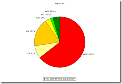
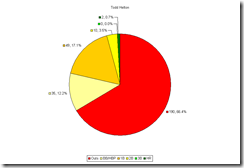
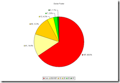
When comparing performance of different players, it can be easy to get overwhelmed by different numbers. So I’ve decided to take a more visual approach to evaluation. By using pie charts showing the six possible outcomes (walk, 1b, 2b, 3b, hr) for a batter and the percentage of plate appearances that each occurs, you can get a good idea of what a player has really done at the plate. Outs are represented by red, while the positive events are in various shades of yellow or green. Raw totals are shown along with the percentages that each event occurred. I’ve done this for this season’s performance (through Aug. 1) for all Rockies players with at least 100 PA’s this year. It should be noted that these charts do not necessarily predict future performance, only what has happened. (Click on the pics to enlarge.)
 |  |
 |  |
 |  |
 |  |
 |  |
 |  |
 |  |
Some interesting things appear when the data is viewed in this way. Jason Giambi has the biggest slice of good events. This directly corresponds to having the highest on base percentage on the team. (The higher the OBP, the more good pie.) What is somewhat surprising as that the higher value events (2b, hr) occur less frequently then you might expect. However, there is still enough green and yellow pie there to not be considered punchless. Carlos Gonzalez’ chart shows that while he hasn’t done something good as often as some of his teammates, the value of what he has done has been very big. With a big chunk of orange, yellow, and green Carlos has clearly done a lot of damage. This also brings new insight to some position battles. Jonny Herrera and Clint Barmes have very similar proportions of red on their chart, however Clint has more green and yellow to Jonny’s orange. In other words, Clint’s advantage in the power department clearly comes through. Similarly, Brad Hawpe’s bigger cream section (walks) doesn’t quite measure up to Seth Smith’s bigger orange and dark green sections.
There are many different options that could be done with these. You could break outs down into strikeouts and outs in play, which would give you a rough idea of who is getting himself out and who is being put out by defenses. You could also have a chart for different splits, over careers or single seasons. I would really like it if others started using this approach to demonstrate player performance. Perhaps one of the big baseball websites that has the technology to do so can include these pie charts along with player profiles, to update with their stats. After all, there’s nothing wrong with having another tool to help us gain insight into player performance.
No comments:
Post a Comment